Welcome to Admin Junkies, Guest — join our community!

Register or log in to explore all our content and services for free on Admin Junkies.

Review Discussion Hub

DiscussionHub.net – a review


These are just some entirely random thoughts and opinions so don’t expect a fully comprehensive rundown of stuff like you’d get from the Site Garage.

Also, don’t take offence – I’ll try to be as constructive as I can but I am a grumpy old man, remember that.

In no particular order:

Favicon. Brill. Loads of people don’t bother.

Logo. I think you’ve missed a trick here as you have changed all the node icons on your node list but used what looks like the default xenForo node icon in your logo. Maybe consider something else. I like the blue on ‘hub’. It’s good that the same colour continues as a highlight throughout.

Tagline. ‘The Hub For all Discussions’ – you’re just repeating your site name. Consider something more creative.

Nodes. Personal preference, but I’m not a fan of having boring site announcements at the top of the page. Consider someone landing on your frontpage. You want your best content immediately obvious. This isn’t it:

1697062428339.png

I’d move the ‘Official’ section to the bottom of your node list.

You have current affairs and debate zone. Most people will debate current affairs. These are meaty subject areas but light on your forum. I’d combine them. Other than that, it seems like there is just the right amount. The only other point is on Website Discussion. I feel you have created this to appease the people who came across from AJ/FP and the like. It’s not necessary. If I want to discuss website management I’ll do it on AJ/FP.

Side bar. Argh! This is a real bugbear of mine. Your sidebar is almost twice as long as your node list. Is that really necessary? The only essential widget is ‘staff online’. The rest can be removed. Play around and see if you can get your sidebar to the same height as your node list, or just short of it if possible. Scrolling all the way down just gives me an empty page.

Content. What content are you most proud of? Maybe a carousel above the node list with image-based links to hot threads. Add some colour. Remember most consumers of content these days are image/video lovers.

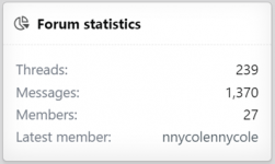
What sets Discussion Hub apart? Where do you see your future? How are you going to attract an audience? Your stats look great:

1697062442465.png

…but of your 27 registered members I count 21 usernames I am familiar with from a AJ/FP. Who is your audience? How will you attract them? Start working on a strategy to sell Discussion Hub to a wider audience. Don’t rely on forum members from forum promotion sites as they will soon move onto the ‘next big thing’. Start planning for what you’re going to do when that happens.
 
Appearance wise - I like the dark theme, and it's great you have two choices to choose from. I would try to find a colorful one to be more of a middle one, or perhaps more customizable one by your members as a third option. Like Al said, I like the favicon represents your community with the initials.

Layout wise - For a General forum I think it's okay having the official/Community hub towards the top. I think the name Official could use something else... Official Headquarters? I find it interesting you have a Feedback subforum, nothing wrong, but I can see it possible that things might end up posted in the wrong area as it is not a norm and people might not read. Do you think it likely you'll do events and what not? That'd be a great forum to put under that first category as well. I understand while you don't have events though, no need to put it there.

General Area is not bad. I would maybe combine Debate Zone and Current Affairs "Serious Discussion" Current Affairs and Debates. This could just be personal preference though.

Entertainment Area I would maybe add a section for Art such as photography, graphic design, writing and etc. I would also add an area for Book Discussions.

I notice there is not much to your descriptions, however your names are pretty straight forward, but I think 2 sentence descriptions would look a bit better. Provide examples of what could be discussed within that area.

I know your community could eventually gain more subforums as you grow, so I think otherwise you have a good layout.

Overall: I think you are on a good track. You have content incoming and that's one of the most important things. I like how you've changed the layout of the Top Posters of the month instead of running downwards and is now sideways!

Get some events going that reel people in and to stay and I think you'll be doing awesome!
 
First of all, thank you for taking the time to leave some feedback, @_al & @Corpse Bride, I really appreciate it! I agree with a lot of the points made and I have already taken a lot of your feedback into account and made relevant changes.

Logo and design - I agree that there is something missing in the logo or design that really makes the site stand out. It is something I am aware of and plan on modifying in the near future.

Tagline - It’s not one of my immediate concerns but I do agree that it could be more creative. It’s something I will be exploring.

Layout - I agree with @_al, I never thought of it before like that. I have changed the category order and moved General to the top.

Forums - I have merged the Current Affairs & Debates forums into one. I think prefixes is a better way of separating the two rather than separate forums. As for the Website Discussion forum, I don’t agree that there shouldn’t be a forum for people to be able to talk about website management just because forums with that niche exist. By that logic, I should also remove the gaming forum because gaming forums exist and same for all the other forums. However, I see what point you’re trying to make and I have decided to merge the Website Discussion forum with the Tech Talk forum to create an Internet & Technology forum instead. I have also removed the Member Showcase forum because you’re probably right, that was just me trying to appease people from promotion forums and it doesn’t bring any value to my site. Also, I think I will withhold from adding more forums for now. I will keep the new forum ideas in mind in the future.

Sidebar - I have played around with the sidebar and it is now level with the node list.

Descriptions - I have changed the forum descriptions. They are improved and longer now.

Events - I have some ideas that I will be implementing very soon.

Strategy - This is something I will need to think about and explore because you’re right, I cannot rely on promotion forums.

Once again, thank you so much for your kind words and constructive feedback. I appreciate both and am glad to have used your help to improve my site! :)
 
Last edited:
Unite, engage, discuss
Gateway to conversations
Ideas unleashed, minds unlocked
Redefining conversations
Community united, thoughts ignited
Where voices find a community

Just a few, of course you'd need to live up to that slogan! Which will be the real challenge. :D Good luck!
 
Unite, engage, discuss
Gateway to conversations
Ideas unleashed, minds unlocked
Redefining conversations
Community united, thoughts ignited
Where voices find a community

Just a few, of course you'd need to live up to that slogan! Which will be the real challenge. :D Good luck!
Thank you for the ideas! I will keep them in mind ;)

I’m planning a logo change and some design changes in the next big update. I think it makes sense to include the slogan change in that.
 
I know you don't necessarily need it when the forum is still semi-new, but consider maybe finding a staff member or two to help generate content for the board and they can also perform events, contests, and stuff like that. Though, this is coming from someone who has 1500+ members on his board and has been flying solo for years now, so take my advice with a grain of salt.
 
I know you don't necessarily need it when the forum is still semi-new, but consider maybe finding a staff member or two to help generate content for the board and they can also perform events, contests, and stuff like that. Though, this is coming from someone who has 1500+ members on his board and has been flying solo for years now, so take my advice with a grain of salt.
I’ve tried going down that route but it’s not easy finding someone devoted to the cause nowadays.
 
I’ve tried going down that route but it’s not easy finding someone devoted to the cause nowadays.
Yeah, I know the feeling. This is one of the primary reasons I've been flying solo for so long. The truly dedicated are hard to find. I'm sure as activity and your statistics increase, you'll be able to find a couple of dedicated users to hire. :)
 
May I make one more suggestion?

1697963203372.png

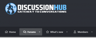
Your logo and the Home button both go to the homepage. You don't need both. Go to Options >> Basic Board Information and remove whatever is in the Home Page URL option.

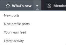
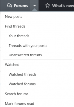
I would look to merge the Forums tab into What's new. Since you're a dedicated forum, you don't need home and forum tabs in the navbar as they're the same thing. This will free up space in your navbar should you wish to add additional menus in the future and give you a much more streamlined and modern appearance. Think about Apple. One of the reasons theirs aesthetic is so popular is because it keeps things minimalist. Minimalism is purity. It shows a real attention to detail if you remove duplicate options and gives the end user the best possible experience.


1697963353291.png1697963374856.png


Just suggestions. Take it or leave it.
 
May I make one more suggestion?

View attachment 2520

Your logo and the Home button both go to the homepage. You don't need both. Go to Options >> Basic Board Information and remove whatever is in the Home Page URL option.

I would look to merge the Forums tab into What's new. Since you're a dedicated forum, you don't need home and forum tabs in the navbar as they're the same thing. This will free up space in your navbar should you wish to add additional menus in the future and give you a much more streamlined and modern appearance. Think about Apple. One of the reasons theirs aesthetic is so popular is because it keeps things minimalist. Minimalism is purity. It shows a real attention to detail if you remove duplicate options and gives the end user the best possible experience.


View attachment 2521View attachment 2522


Just suggestions. Take it or leave it.
I’ve removed the Home tab on the navbar. I didn’t think of it before so thanks for pointing it out. I’m going to leave the Forums and What’s New tabs as they are for the moment otherwise the navbar will appear a little empty. Thanks again for your suggestions! :)
 

Log in or register to unlock full forum benefits!

Log in or register to unlock full forum benefits!

Register

Register on Admin Junkies completely free.

Register now
Log in

If you have an account, please log in

Log in
Activity
So far there's no one here

Users who are viewing this thread

Would You Rather #9

  • Start a forum in a popular but highly competitive niche

    Votes: 5 21.7%
  • Initiate a forum within a limited-known niche with zero competition

    Votes: 18 78.3%
Win this space by entering the Website of The Month Contest

Theme editor

Theme customizations

Graphic Backgrounds

Granite Backgrounds