Was this theme made strictly for mobile? On desktop, the organization of the theme just seems a bit odd.
Lets start off at the top.
- The top on mobile.
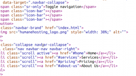
- Logo is not centered in the frame.
- Logo is way too small and the colors clash with the background.
- The carousel.
- I would use images for the background that revolve around hosting. A Gamecube gaming console has no correlation with website hosting.
- The welcome to HumaneHosting has a microphone background, again has no correlation with hosting.
- "We even got your data backed up on a best efforts basis! We will do our best to minimally holds a week worth of data done once a day."
This is completely wrong. I get what you are attempting to say, so it should be along the lines of:
"We do our very best to keep your data backed up. We hold your content backups for 1 week, with backups completed each day."
This is all I had time to review at the moment.


 Welcome to Admin Junkies