I prefer to use font awesome for my icons on my forums, since they offer free icons and are pretty easy to use. I'm not the best artist, so I think Font Awesome is a great resource. I know having unique icons really make a forum stand out, but I believe using Font Awesome icons is fine. Do you use Font Awesome icons? Do you think these icons look good?
Welcome to Admin Junkies, Guest — join our community!
Register or log in to explore all our content and services for free on Admin Junkies.
You are using an out of date browser. It may not display this or other websites correctly.
You should upgrade or use an alternative browser.
You should upgrade or use an alternative browser.
Do you use Font Awesome for your forum icons?
- Thread starter Ravenfreak
- Start date
I have never used Font Awesome before at all. I had no clue about it actually.
Font awesome is … awesome. Doesn’t take much time to load in comparison to images. Definitely a better alternative for images to reduce load times.
No, but I do use fonts from my own server for the boards, posts and threads to come out right.
Moonface
Recognized member
Not only this but Font Awesome icons will also scale infinitely due to being rendered like text, and if someone was browsing with images disabled they would still see useful icons.Font awesome is … awesome. Doesn’t take much time to load in comparison to images. Definitely a better alternative for images to reduce load times.
The above is only true if using Font Awesome as a font - except the complete download also supplies every individual glyph as an svg too. In an ideal world you'd build the specific bundle of images you were using, or transcluding the SVGs directly into the markup for even better performance if you're only using a few.
I've made the journey of replacing the PNG icons I have (both from Crystal Project and from Fugue) to Font Awesome but at the same time I'm a bit... hesitant. Many of the icons are fine, because they have standard and irreplaceable meanings but there's plenty of icons that mean different things to different people in different contexts and I'm not sure that's necessarily the best way to go.
Meanwhile there is also the small problem that Font Awesome while highly functional and (mostly) efficient, they're also everywhere. It's hard to get some personality going when everyone's using the same icons.
The only time I remember ever using Font Awesome was in a fancy sidebar I created and released on my board for administrator's use. I wouldn't mind using Font Awesome in future skins I create as they do look really sleek and I'm sure it'll help your site run more smoothly than graphics would.
Yeah, we do that at work, our themes maintain a folder full of SVGs that get automatically rebuilt on deploy, to build the font and include it into the site SCSS so we can use the icons in the site theme easily.
J
-JuNioR-
Guest
I used to rely on Material Design Icons for some time before switching to Font Awesome permanently. I am currently using version 6.1.0 and am very happy with it. Looks great when paired with Quicksand👌
I use Font-Awesome quite a bit. I do like that there are alternatives out there though. I sadly can't remember any off the top of my head though.
For XenForo, I try to. It loads faster and looks uniform with everything else.
No, I use images specific to the niche of the site.... It make it really easy to see (besides the big read/white NEW indicator) where new posts are.

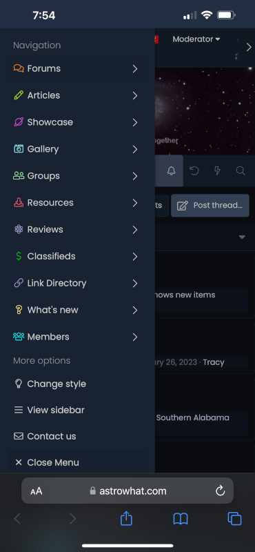
As for FA on the site.. yep... I use them for menu choices
Desktop

Mobile

As for FA on the site.. yep... I use them for menu choices
Desktop
Mobile
Log in or register to unlock full forum benefits!
Log in or register to unlock full forum benefits!
Similar threads
- Replies
- 4
- Views
- 365
🎨 Theme Design
Paying for forum theme
- Replies
- 1
- Views
- 670
- Replies
- 2
- Views
- 183
- Replies
- 5
- Views
- 2K
Who read this thread
(Total readers: 0)
No registered users viewing this thread.
New Threads
-
Using business cards to promote your site
- Started by Ravenfreak
- Replies: 0
-
Tech Support One reason to use DKIM/DMARC (and other MTA related security features)
- Started by Tracy
- Replies: 0
-
How to backup Office 365 emails to hard drive?
- Started by louisyoung044
- Replies: 0
-
-

 Welcome to Admin Junkies