Welcome to Admin Junkies, Guest — join our community!

Register or log in to explore all our content and services for free on Admin Junkies.

General Front page = list of boards?

For all the diverse topics that don't quite fit elsewhere.
I've definitely seen forums with confusing layouts where the 'correct' board is not actually that obvious, especially if the topic could sit between one or more boards.

But there's *always* going to be the people too impatient to read, no matter how tidy your board layout is. Doubly so if you're a support resource where in spite of the layout being designed to focus your problem towards the people who can help, inevitably the first nearest board is picked instead, unless they're actually paying attention (experience does not validate this as above 60% of the time)


I think the 'all the categories' or 'all the most recent' are both one-size-fits-no-one approaches, and I think a far more useful homepage is one that actually curates what is shown.

I asked a bunch of grumpy old technical people about this a few months back, the results were interesting. It was a 65/35 split between 'latest posts' and 'board listing' as front page, but inevitably this was framed in a 'I'm a regular, I either want to see what's new, or I want to curate what I bother to look at'. That group of people absolutely self-select into 'I know what I want/what I'm looking for, leave me alone' types. But it was interesting to note that once you took the 'I'm a regular' out of it, the views on what the front page should contain were far more distributed than tribal.

I think this really points to the fact that the landing page has to do different duty for different people and that regulars may not even see it at all (as per @CedricV noting that the what's new page is high up on analytics). For newcomers it's definitely a billboard of things you want them to look at, and they'll have their own take about what they're looking for on that billboard.
I agree, if it's poorly layed out, that changes everything. It should be easy to read in a few words and then the rest is just extra description.

As far as curated content goes, I'm not a fan of that either, if you're talking an algorithm. It's why I left social media because there information is used to manipulate you in many different ways but #1 is always to keep you there. I don't like it because, while I am entertained, it keeps me ignorant on other things they aren't showing me.

I know the vast majority aren't like this though and on this subject there will never be any perfect solution. I just don't really see a problem with any layout. There is no "old" or "new", just " different". I don't see any big problems in either style of layout, but I don't like the excuse of people being too bothered to click a few times being a reason against traditional layouts.
 
Advertisement Placeholder
I've always preferred the traditional way of listing the forums as the front page. Then again, I use Jcink and we have an active topic page that by default, only shows active topics from today, and a view new posts page that shows new posts since you last visited. There isn't an option to view multitudes of unread topics maybe unless you select a different filter from the active topics page, which is no more than a month.

It just seems like everyone gets a clean representation of the forum when the forum index is on the front page. Sure, content is king and the What's New page could show you relevant content based on the niche of your board, but I find the organization better when the forum index is the front page. You can go to specific forums to view the topics of your interest and not have to worry about a jumble of content to sift through to find topics of interest. I'm an organized person overall and it just seems the forum index is more organized than having a never-ending list of topics to browse through, but it could all depend on the niche of your board too.
 
This is a group who, largely, don't have the discipline to write on a schedule - if they ever did, they might actually make it as Writers and Authors.
The question then becomes, can I use technology to incentivize users to stay disciplined a la gamification, behavioral nudges, etc?

My experience is that there are three groups of people in this arena: the folks who can be world-consistent but creative (good), the folks who can't be world-consistent and/or want to jam whatever pet fan-favourite in (bad), and the people who aren't really imaginative either way who will just poddle along at their own pace (not a problem). I am being very reductive here, but to try to do this scene justice takes more words than I have time for.
This is really good insight, and I would point out that this problem exists on forum discussion as a whole. You have 3 broad groups of people:
  • People who are on-topic and drive the discussion to its successful conclusion
  • People who throw out interesting things of substance but go off on tangents
  • People who, and I do enjoy your lexicon, poddle along in their own conversations that don't add anything of substance.
All 3 groups of people have managed to happily coexist on forums this entire time, although there are probably better ways to prioritizing and surfacing the content from these distinct groups. I suppose in your RP world of beavers and deer hot romance, there might be stricter guidelines.
 
This is really good insight, and I would point out that this problem exists on forum discussion as a whole. You have 3 broad groups of people:
  • People who are on-topic and drive the discussion to its successful conclusion
  • People who throw out interesting things of substance but go off on tangents
  • People who, and I do enjoy your language, poddle along in their own conversations that don't add anything of substance.
For regular forums that's typically true. Some forums (the aforementioned digital wasteland) are more than happy for topics to veer wildly and careen all over the place, to the point where being on-topic is considered 'doing it wrong' with an emoji that has been officially blessed as the :doing-it-wrong: symbol for the forum. It's a long story, a meme that was months in the making, unfolding in real time.

Interesting side note: Discourse's original philosophy was to strongly discourage the second group and try to suggest that 'going off topic is uncivilised behaviour' with features like 'reply as new topic' to incentivise them to make their own topic at a tangent. I've never believed that was the answer to the problem, just as threaded replies was never quite the answer to the problem, because that's how people behave out in real world discussions - they meander and prevaricate and topics ebb and flow between points of view and gradually evolve. And it's wonderful.

I've observed over the years that a healthy forum actually has a healthy contingent of all of the above. You need the people who open topics with a focus and a point of view, and people to respond on topic to bring it to a useful conclusion, but that's only useful on its own if your focus is Q&A or support; you need the substance and tangents to provide wider discussion. And the 'poddling along' people are those who aren't interested in being trailblazers and laser-focused but they are the heartland of the community in most cases.

For roleplays I do want to be quite specific about the third group, and I don't want to unfairly paint them in a light that isn't quite accurate. They will do their own thing and that's fine. It's even encouraged from time to time, even for characters who are otherwise Important to the site, to have topics that aren't important. I've got a character right now that is Important, a key player in multiple of the big site-wide plots that are coming up, who is currently off halfway across the world talking to a tattoo artist about a backpiece. The tattoo artist character's writer is new to the site, and this was a fun way to a) have downtime for me, b) to introduce them and get them going and c) have a thread that's not important for worldbuilding. It doesn't establish any world lore, it doesn't implicitly define any rules in the world, merely that in one city, in one province, there is a tattoo artist. It's completely inconsequential for worldbuilding - but in other respects it's quite important.

This is the sort of quirk RP has, having a topic with one of the admins is often (but not always) A Big Deal. It's also one of the more interesting responsibilities that admins have to not just exclusively write with each other if at all possible, though that isn't always feasible or practical (especially important if you're trying to avoid clique culture which is a huge problem)

In the case of Real Life sites, it's almost the norm that *everyone* does these sorts of topics, but when your setting is 'a place that already exists' and you're telling stories of 'ordinary people in these places' there's only so much latitude you're going to get with worldbuilding and whatnot. It's often a meme that in the Real Life sites, characters go on 'cake and coffee threads' as an excuse to hang out - and that's also fine if you just enjoy writing about socialising. But it's never going to move the needle on worldbuilding. Other genres that have a flavour, you're probably going to build that in as you go because again, that's the appeal of the environment.


Bringing this back to the original topic, there are interesting questions about how to spotlight and encourage all of this, including on the front page and elsewhere. The board structure does an amount of the structuralising and signposting of where things are (at least, generally) and sites that have plenty of extra boards tend to have processes mimicked by boards and topics moving between them. That whole process, in my head, is because there aren't better tools for it, and that's something I've long thought should be obsolete, but clearly isn't.

Which then leaves 'what else do you do with the front page'? Well, it is extremely common, even borderline necessary on many sites, to have a small paragraph of leading text somewhere on the front page to sum up the site to newcomers. A short paragraph to set the stage, the plot and the mood all in one. Sites that are private/semi-private don't usually feel the need quite so hard, they'll do that during advertising or in their 1-on-1 introductions when vetting new people.

The only common feature I do see on front pages is signposting to 'guidebooks', which is usually shorthand for '1-10 pages of fluff about the site', pages about the setting and whatever established world history there is, pages describing any extra rules or systems (e.g. sites over in the fantasy arena may well have magic, and establishing what magic exists and what its rules are will be a function of this). But it's fairly common to make that a single link or even a redirect board to a starting page and all the stuff will be from there.

Birthdays inevitably aren't interesting (though 'this character was made a year ago' type stuff could be interesting to spotlight if it were easier to do), profile posts are a feature I don't think Jcink has, and I've definitely not seen it be used or spotlighted at all even on places where I know it's a feature. But most interestingly, you just don't see people having 'featured threads' or similar. Probably because it's so implicitly judgemental and subjective that you don't want to do it - same reason that 'xyz of the month' is highly contentious between 'I love the idea because it provides a spotlight to people' and 'I hate the idea because it's biased', and 'topic of the month' absolutely swings towards the latter of that.

Part of the reason I brought this topic up was to try to look at the problem from a different angle and try to examine some of my own biases (and also those of the wider community by extension). I wanted to try to get some insight into whether people looked at this whole thing as a form of expectation, of normalcy, and/or whether this is one of those things where 'this is what the software does and I can't change it' and so people end up just working with what they have - and unable to conceive of what else you could do with it 'if only it were possible'.

I asked this question elsewhere in a mildly (deliberately) inflammatory way, with a view of 'meh Jcink folks just use this because it's all they have' knowing full well that there is a portal option in Jcink and you can stack blocks etc. on the front page - people are very quick to 'educate' online... but what was interesting is that while there were no shortage of people telling me I could make my very own front page like the splash pages of old, no-one had any interesting ideas about what else one could put on the front page. (I did have a secondary agenda in asking; one of the common traits of the day is having the front page have a massive screen-sized banner/header in lieu of a splash/landing page of old, and I was positing that the reason people did this was because they couldn't make a front page properly and just hacked it into the forum listing anyway)

Coming full circle I think the list of boards still has a part to play but sometimes I wonder if it *is* the best way. Certainly there are advocates for it - though I rather think that does rely in no small part on people actually having sane structure - but when I see sites having 50 boards visible on the front page (like some of the sites I linked previously, go count, that's what's going on), I have to wonder if this really is the best route after all, because we're back to the 'first impressions/new user' vs 'recurring/regular user' and the different needs these people have, and as much as we can sit and go back and forth, we're not escaping the fact that these two demographics *do* have different things they need to get out of the board index, whether that's the front page or not.

I think there's more that we can do here. Oh, and to the point of 'curated content' on the front page, nothing says it has to be algorithmically curated; if you're going to spotlight some kind of content on the front page you probably want someone to manually pick it to be showcased rather than letting an algorithm decide. No-one in this space is hyperscale, every topic deserves a chance to shine.
 
Part of the reason I brought this topic up was to try to look at the problem from a different angle and try to examine some of my own biases (and also those of the wider community by extension). I wanted to try to get some insight into whether people looked at this whole thing as a form of expectation, of normalcy, and/or whether this is one of those things where 'this is what the software does and I can't change it' and so people end up just working with what they have - and unable to conceive of what else you could do with it 'if only it were possible'.
It's always a problem for us plebian administrators, since we're bound to the functionality of the actual software. (No use dreaming when we can't actually do anything about it)

If I were to dreamwish my ideal homepage for online communities, it would be something like:

For Guests:
- A guest registration sign-in widget that quickly explains the purpose of the community
- Most popular / authoritative resources aka Must Reads
- Most popular / trending discussions
- A big search box along with common searches
Not necessarily in that order

For Logged in Uses:
- Discussions that I've participated in or started
- Most Recent discussions
- Most popular / trending discussions
Preferably all wrapped together into a single stream in an algorithmic manner
 
It's always a problem for us plebian administrators, since we're bound to the functionality of the actual software. (No use dreaming when we can't actually do anything about it)
Going to let you into a little secret (ssh, don't tell anyone)

There's no secret conspiracy that requires you to have a degree in computer science before writing a single line of code, no weird hazing rituals or secret trials you must complete. We honestly don't have one in the cult of programming unless you want to work at FAANG and even then that's a FAANG thing not a general dev thing. Honestly. I started out back in the day with existing code and just tweaking it to see what I could make it do. I just never stopped.

On a more sane note, I feel like this list is achievable with existing portal-type systems that can put things in widgets and just displayed nicely on the page. There's a lot of hangup about people doing things with algorithms, makes people twitchy about 'what am I not being shown' but in practice as long as the full list of content is accessible and readily sign-posted, this seems to not be a huge problem.
 
I've used all sorts of methods as my front page...

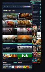
I've highlighted some of the features on our site and showcased them along with the standard thread/post widgets that I've customized to my taste. I actually just use this page now as a "community wall" that members/visitors can click on for a quick showcase overview

highlights.png

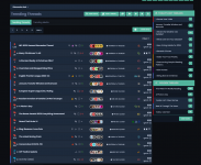
I've used "trending topics" so people can see what is currently being discussed on our site

trending.png

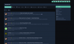
And I'm currently using "real time" feeds to show the latest activity, new threads, latest posts, profile updates etc

realtime.png

In my ideal world, a mix of all three would be my front page but sadly that isn't possible. Also, the option for my members to set their own front page would be something I'd like to have but I don't think I've ever seen a platform with that avaialble.
 
sadly that isn't possible
Anything's possible with code :) Just need to find you someone to make it for you.

But I am finding it interesting that there is an appetite for something more mixed on the front page, as well as options for curation; I've long thought that it should be possible for people to favourite boards and raise them on the board index as a result.
 
What I'd like is some kind of modular functionality possible for the members to choose how THEY want to see the front page. Nevermind us admins how WE want it, our members need to be able to setup the forum as they seem fit. Now that would be groundbreaking. That would be a code I'd love to be able to write.
 
So my site lists first: all the roleplays, then when you click into the roleplay, it has a header, buttons for setting, faces, and groups, and then it's a list of last replied to topics.
 
Which sounds like any normal category system, but still nothing you can get off the shelf short of taking an entire platform and customising it - there is no 'category system as a library' that is usable in any meaningful fashion here.

How you approach taxonomy (categories, boards, tags, whatever) is so fundamental to a platform that you have to bake it in up front, there's no way around that.
 
This is our front page.
frontpage.png


It is baked into our software but that's because we've made it from scratch and it's not really totally forum based. Or it is, with a lot of the BS in making a forum is thrown out. There is no interface for making categories and boards, for example, there's just an "Add RP" button where you name the RP, add in a header, info, custom CSS, and bam.

addrp.png


The same pretty much goes for everything inside the RPs. Just add new character, add new thread, etc.

But for an already established software, the first thing I always look at are the newest posts/topics listing, so for me, it makes the most sense for a site to have that as the front page.
 
I think the whole wall of topics Flarum and other softwares adapted is coming from huge forums such as:


These are just two examples where one forum has majority of the content. In my opinion, I have never seen more cluttered-ness together yet it seems to work for them. I think if you're not used to the concept of forums like we have, and thus expect somewhat decent organization, then you'll roll with whatever you come across.

And that's even on Tapatalk, there isn't an even worse software available.
 
Discourse was the one pushing it hard philosophically in 2013-2014 when they were new (though, technically, Vanilla was doing it earlier) on the basis that it encouraged people to a) see the variety of content around which would b) be more engaging that hitting a filing system first, and c) reflects that the community is active and discussing things.

Atwood and I disagree on many, many things about how forums work philosophically and practically, but I find it hard to argue that he’s fundamentally wrong here.

In his mind, Discourse was started to fundamentally rethink forums, or as he put it, to get away from “1990x toxic hellstew” thinking, and gutting the list of categories by default as your front page certainly does that.

I look back at the replies and there is one common element in them from the admins here, that it’s what they like. What do your members think? (The fact that what’s new is strong in analytics tells us something about the needs of regulars vs the needs of new visitors.)

edit: when I get time, I’ll dig out the really big long thread I had elsewhere where I asked similar questions to direct users rather than admins. The results were… interesting.
 
Last edited:
For context, this was asked on a forum that has seen migration from something really old and clunky to Discourse to NodeBB with custom dev along the way. It is full of obscenely technical people - and, inexplicably, me - and people who know how to speak their mind should they want to. If you think I am a grumpy old man, you ain't seen nothing.

Now, for context, I raised the following pointed questions - while 3 & 4 are the ones relevant to this topic, all the questions and their responses were really, really interesting:
  1. Infinite scroll, yay/nay? If yay, what do you like about it? If nay, what about it makes you reflexively hate it?
  2. How often do you need to express something that mostly-basic Markdown can’t do? Do you find yourself missing bbcode?
  3. When you first visit a forum for the first time, how do you get there and what information do you want to see?
  4. When you return to a forum (having registered and are now conceptually on the journey to becoming a regular), what are the first and second things you most want to get at or be shown on the screen? (If you have a top 3, or more, please share)
  5. Does necroposting annoy you? If so, how come?
  6. Do you care about the ability to create polls?
  7. Live streaming of posts/updates as they happen, good, bad, you don’t care?
I was specific in what I wanted to know and what vibe I was getting at. Note that 7 specifically is a feature you don't see in XF much - it's not the 'more responses have been written while you were posting' message, but actually pulling the posts in *while you're on the page*, fully live. (Discourse and NodeBB have higher requirements for running than something like XF or phpBB. This is in no small part why.)

So, summarising of the results:
1. Infinite scroll
Meh: 5 (general responses aligned along 'yes if works and doesn't bounce all over the show, can't easily navigate to where you want but that's not necessarily a problem if you don't need to read every post; yes if it works but it doesn't usually work well)
Nay: 8 (general responses: too easy to lose my place, how many I read/how many left to read aren't clear at a glance)
Yay: 1 (general responses: likeable but best if optional)

Also worth noting that the 'meh' answers definitely had some on the fence vibes, e.g. 'yes if it works well, no if it doesn't' but the navigation complaint came up multiple times.

2. Missing bbcode
Virtually no-one really missed bbcode, most people noted that in forum posts Markdown was usually enough, and that for the cases it isn't, basic HTML is often accepted in its place which from a user entry perspective is often about the same effort. Buttons for the obvious functions are good. Probably the biggest complaint point was spoilers, which in NodeBB is done with the <details> and <summary> HTML tags, and something else would be nicer.

Some even noted that they were so used to Markdown that they were doing it habitually and then finding forums not supporting it.

Probably the most interesting answer was the person who referenced 1984, correctly noting that 'if you cannot express something in a language you use, you will eventually stop wanting to use it', which means if you don't have (say) tables, eventually you'll get to a point where you're so used to not having tables and having worked around it, that this will now be your default path even in places where you conceptually could.

Some cautionary notes in there on not letting content escape outside the post area for fancier things.

3. Visiting for the first time
Responses were split here, but about half the people who did response to this question noted that they came from search and so expected to be directly on some content; the other half noted the list of boards, and often specifically to find a board or boards for a specific broad topic to read one or more topics in.

General disdain for forums that hide things until registered. Several respondents did point out that easily-findable registration would be good, particularly if they're about to make the step from viewer to registered member, though most noted they only wanted to do that if they wanted to post.

4. Regular/recurring member experience
Now this was interesting. There were a few people who noted that they wanted the category listing to be able to see which board or boards had new items, but for the vast majority of respondents, they noted that what they wanted to see more than anything was content related to them. Where they'd gotten replies, where they'd gotten mentions, where they'd gotten likes/reactions, topics that they'd previously posted in getting new replies, followed by maybe a list of other current regular topics.

It was very interesting how people almost make the case for the front page replicating the alerts/notifications window in some ways, but organised by level of engagement rather than strictly chronologically.

5. Necroposting
Interestingly mixed reaction here but that feels contextual. This is a forum where 10 year plus necros can and do occasionally happen, though usually it's more like a year or two in practice.

A good proportion of the respondents were like 'nah it's all fine' but of those who did have anything more to add, the main bulk felt along the lines of 'if it's a topic I haven't seen before, I usually want to catch up' before noting that the UI may hide away how much of a task that might be (back to the infinite scroll problem)

One noted that spam was annoying when it did this (because spammers are more likely to do this)

6. Polls
Quite interested to see that almost no-one cared and that in some respects, they'd almost rather not have polls because it's the long-tail answers that are more interesting. Did not expect that.

7. Streaming in posts
This had some overlap with the infinite scroll situation - generally 'don't move things around the page unless I want you to' which can happen even on regular forums with images (because the images can resize the post area vertically once loaded) but is much worse with infinite scroll, and when adding new posts in rather than a small, easily-overlooked message above the reply box, this is far more likely to mess you up if you're typing.

It is, interestingly, one of the reasons that NodeBB's reply feature is basically a modal on top of the thread view, even in mobile, because that way if new content loads in, it doesn't move where you're typing.

But on a forum that does move enough that threads can get reactions and replies while you're reading, this was generally felt to be a positive move rather than a negative one (and is the reason that in the wake of Discourse, they went NodeBB rather than XenForo because they liked the modernness of it and this was one of the big selling features specifically, the other was Markdown)

There's more to share from that thread, and I'll do that some other time, but the board index in particular was interesting to me, especially because I think asking *users who aren't admins* gets you interesting feedback about how features really get used on a site. The rest just came along for the ride here but I think it reinforces the side point that we shouldn't make assumptions about user behaviours based on our own behaviours. We like the board listing - the users... maybe not quite so much.
 

Log in or register to unlock full forum benefits!

Log in or register to unlock full forum benefits!

Register

Register on Admin Junkies completely free.

Register now
Log in

If you have an account, please log in

Log in
Who read this thread (Total readers: 0)
No registered users viewing this thread.

Would You Rather #9

  • Start a forum in a popular but highly competitive niche

    Votes: 9 27.3%
  • Initiate a forum within a limited-known niche with zero competition

    Votes: 24 72.7%
Win this space by entering the Website of The Month Contest

Theme editor

Theme customizations

Graphic Backgrounds

Granite Backgrounds